Description
In this project, I collaborated closely with the product owner, contributing significantly to various aspects of the user experience. My work included translating requirements and insights into wireframes, iterating on solutions, and helping establish a scalable design system to ensure visual and interaction consistency. This project involved continuous collaboration, iteration, and validation, strengthening a user-centered design process while aligning design outcomes with product goals.
Client
Ladorian via Oppro
Year
2022-2023
Role
UX/ UI Designer
Type
SaaS
brand
Ladorian is an AI and Retail Media scale-up that has developed software based on unique technology to transform physical stores into smart ones. By running personalized marketing campaigns at the point of sale, Ladorian maximize sales in a sustainable way to reach the target audience.
challenge
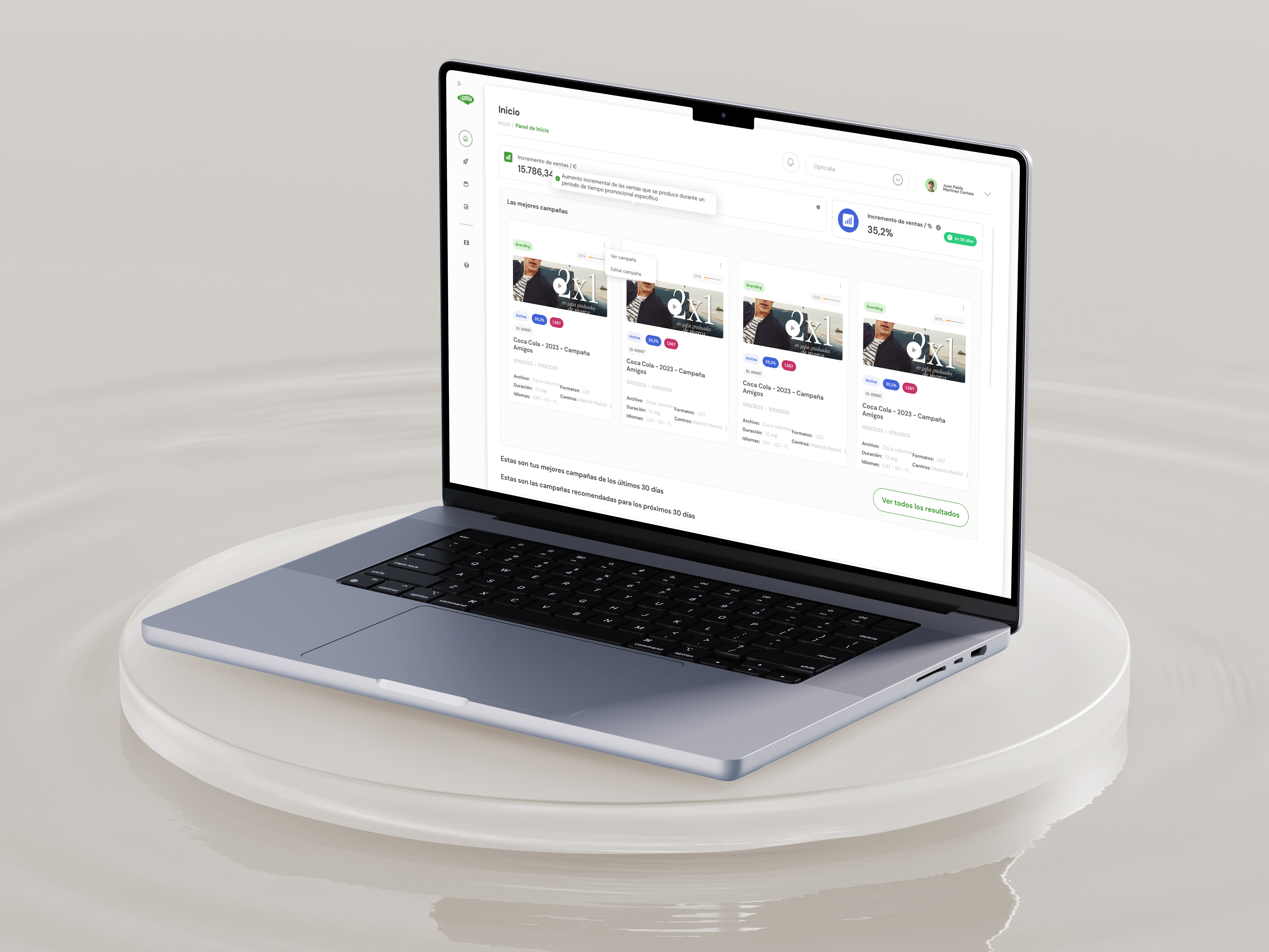
During the initial evaluation of Ladorian’s software, we identified several structural and usability issues that were negatively impacting both the user experience and the overall efficiency of the product. The interface lacked clear organization, making it difficult for users to understand the overall journey and navigate confidently. Key workflows were not intuitive, guidance was limited, and certain automated processes were delayed or insufficiently optimized, creating friction in task completion.
Our objective was to simplify the product structure, make navigation more intuitive, and design user journeys that were clearer, more efficient, and easier to follow. In parallel, we aimed to make the interface more visually appealing and approachable by defining a coherent visual language and establishing a consistent design system.
SOLUTIONS
Working closely with the product owner I contributed to a structured end-to-end redesign process. We began by conducting user interviews to uncover pain points and validate assumptions, followed by a heuristic evaluation to identify key usability gaps. Based on these insights we mapped the user journey and redesigned the entire software experience, creating a fully coherent design system to support scalability and consistency.
RESULTS
The overhaul of the product allowed us to reshape the entire experience, replacing friction and ambiguity with a solution that feels intuitive, efficient, and visually appealing.
These improvements translated into strong measurable impact: conversion rates climbed by 35%, users spent 50% more time engaging with the product, and overall sentiment shifted noticeably toward positive evaluations.